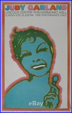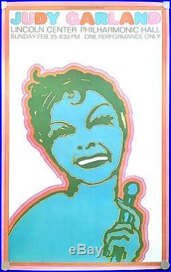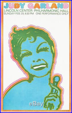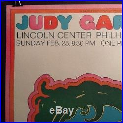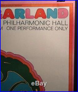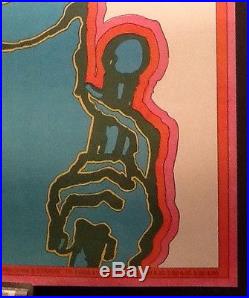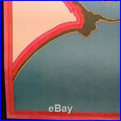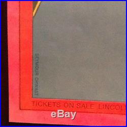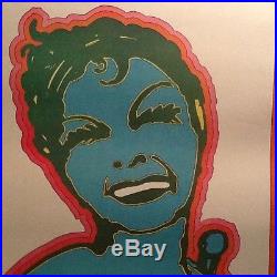


Beautiful graphic poster by Seymour Chwast for the Judy Garland concert at Lincoln Center Philharmonic Hall on Sunday, Feb. 36 5/8 x 23 (93 x 58.4 cm) offset lithograph in essentially MINT condition. Guaranteed vintage and authentic. Throughout much of 1967 Judy Garland had committed to and completed a. Back-breaking concert tour, to. By early 1968 she was residing. Primarily in New York City, usually with her children, living. And performing at single engagements. She auditioned to take over the. Show MAME, but the backers would not agree. Then there was a very. Publicized disastrous concert in. Later she was in better form and performed at the. Philharmonic Hall in the nearly. Finished Lincoln Center (construction progressed between 1959-69). One night only and she performed some of her best known songs. Return a few months later. To sing at a tribute to her composer, Harold Arlen. This one night event, Seymour Chwast created this. Of Judy for this special poster. Biography by Steven Heller. 1931, Bronx, New York. It would be difficult to imagine contemporary American and European graphic design and illustration without the presence of Seymour Chwast. By the middle of the 1950s, as the Norman Rockwell epoch drew to a close, Chwast was already known for his unique style of illustration. His playful, expressive approach to type and layout was the point of a new design wave based on revivalisma radical alternative to the Swiss formalism of the time. For over 30 years he has continued to ride above the twists and turns of fashion; today his art is even more energized and varied than when it originally altered a generation’s perceptions. Chwast’s work is widely recognized on posters, in books for children and adults, magazines and advertisements. His strength is not in rendering, like so many of the sentimentalists before him, but in concept and design. A beguiling sense of humor underpins his illustration, and a keen understanding of traditional design governs his method. Chwast and his Push Pin colleagues helped reintroduce the long divorced principles of illustration and design. Moreover, he helped formulate a new graphic lexicon based on knowledge, appreciation and reapplication of past styles and formsone that has had long term effects on graphic design. Born in 1931 in The Bronx, New York, Chwast began drawing in earnest at the age of seven, and soon attended WPA-sponsored art classes. He became profoundly aware of the difference between museum and street art and seemed to instinctively prefer the allure of billboards and advertisements to Picassos and Mondrians. Influenced by Walt Disney, the Sunday funnies and serial movies, he gave life to his own cartoon heroes, including Jim Lightning and Lucky Day. His family moved to Coney Island, where he was enrolled in Abraham Lincoln High School. On the outside this was an ordinary New York City public school, but inside it was a hotbed of graphic design education. Chwast was accepted as a member of the elite Art Squad. This roving band of sign and poster artists was a spin-off of a graphic design class taught by Leon Friend, teacher of such design notables as Gene Federico and Alex Steinweiss. It was at Lincoln that Chwast learned to appreciate type, graphic images and the possibilities of commercial art. Friend believed that there was no greater glory for an artist than to have his work printed, and demanded that his students enter all competitions open to them. At sixteen, his first illustration was published in a reader’s column in. Magazine, art directed by Cipe Pineles. This early indoctrination in the applied arts was total and unalterable. In 1948 Chwast entered New York’s Cooper Union, matriculating with Edward Sorel and Milton Glaser, with whom he would found the Push Pin studio. During the Cooper years Chwast was influenced by the graphic work of Ben Shahn, Georg Grosz, Georges Rouault and Honoré Daumier. The conceptual strength of these stylistically diverse but like-spirited critical commentators was reflected in his own penchant for expressive woodcuts. One of Chwast’s earliest, and still provocative, works in entitled. The Book of Battle. A handprinted, handbound and handcolored anti-war statement. The social commitment shown in this book became a recurring theme. As for his comic bent, Chwast’s most direct antecedents were André François and Saul Steinberg, masters of paradox and irony. A direct link between their brand of cartoon/illustration and Chwast’s surreal comedy is still evident. Because Cooper Union was tied to a fashionable abstract dogma at that time, Chwast’s education was as much one of rejection as of acceptance. The realization that he couldn’t paintspecifically in the proscribed mannerand that he had no interest in creating illusion for its own sake pushed him into more accessible artistic realms. In their second school year, Chwast, Glaser and Reynold Ruffins formed a studio called Design Plus. After completing two jobs together (a flyer for a theatrical event and a children’s book) they went out of business. If it would have been impossible to predict the eventual fruits of the Design Plus collaboration, it would have been equally hard to believe that Chwast would continue in graphic design after the results of his first five jobs. Upon graduating from Cooper Union he worked for a year in. The New York Times. Promotion department where, under the tutelage of art director George Krikorian, Chwast learned the principles of typography and was given design and illustration assignments. Subsequent jobs, however, weren’t as satisfactory. A string of failures began with a bullpen post at. Magazine (fired because he couldn’t do comps). Finally, during a stint in Condé Nast’s art department Chwast began to solicit freelance work. Together with Ruffins and Sorel, Chwast produced a promotional piece designed to show prospective clients that ideas were as central to design and illustration as was rendering. The result was a semi-regular publication called the. Each issue included drawing, text and trivia with a specific theme. At the time there were a few other continuity promotions, but none so ambitious or inventive as the. Chwast credits Glaser for realizing that a studio would offer greater long range possibilities for the individuals involved. In 1954 it was possible to start a business with very little capital. Illustration assignments for educational slide shows and rendering for package design proposals provided a respectable cash flow. The Push Pin approach took time to evolve. While studio members would work together on design projects, editorial illustration was individual. A collective impulse to broaden the boundaries of accepted methods and to unify design and illustration was the impetus to rename and expand the. From the outset this visually exuberant periodical caused a stir in the design community. It was not only an effective means of showing off the studio’s talents, but proved to be a major influence on the design and art direction of the late Fifties and early Sixties, specifically in the convergence of illustration and design. A minor, yet interesting, graphic development which attests to the impact of the. Occurred when Chwast and Glaser placed all the art in one issue in boxes with rounded corners. Within weeks rounded corners were adopted by others as a motif in magazines and ads. Because of its eclecticism, which was influenced by venerable design styles including Victoriana and Art Nouveau, some critics accused Push Pin of contributing to the demise of modernism. Push Pin was, in fact, creating contemporary contexts for once viable forms, foreshadowing the Post-Modernism of the Eighties but not purposefully reacting to current practices or theories. Chwast recalls that he gave up woodcuts in the Sixties because the expressionistic vocabulary had lost its vitality. Clients were asking for certain looks and moods, and Chwast saw his role as fulfilling this need. For example, Victoriana was associated with the Push Pin look, but it was just one of those styles coming into vogue. Chwast’s roxy look (which was what he called Art Deco before he knew that it had a real name) derived from Steinberg’s graphic musings. Rather than mimicking the past, Chwast was more interested in adapting, integrating and making it contemporary. What became known as the Push Pin Stylethe distinctive, eclectic union of illustration and designderived, according to Chwast, not from premeditation but from the requisites of the assignments themselves. It was a desire to state the client’s message in as personal yet as accessible a vocabulary as possible. Although Chwast says that both he and the studio were swept along with the pop thing of the Sixtiesbright colors and stylized outline drawingssuch a statement tends to diminish the significance of his innovative instincts and savvy applications. Push Pin was on the cutting edge of popular art. The studio’s approach was consistent with other changes in the culture, and often served to visually represent them. This was manifest in the highly visible, mass media jobs, including book jackets, record covers, posters, advertisements and magazine covers. Despite this intense visibility, Push Pin was more influential than it was wealthy. Unlike large corporate design firms servicing ongoing and lucrative identity programs, Push Pin was working on an assignment-to-assignment basis. One reason was that the diverse nature of their collective work was anathema to accepted rules of corporate image. Push Pin brokered best in the realm of what might be called editorial ideas. During the mid- to late-Sixties Push Pin was a magnet for designers and illustrators, including James McMullan, Paul Davis, Barry Zaid, Sam Antupit, John Alcorn and George Stavrinos. While decidedly influenced by Push Pin’s strong graphic personality, these members also contributed their own approaches to the studio. This collaborative environment has been a significant model for others. The historic exhibition at the Louvre’s Musée des Arts Decorativs in 1970 underscored the institutionalization of Push Pin. It was the first time an American design studio was honored in this way. Critics applauded Push Pin for its non-conformity, and voiced surprise that such work would be supported by a capitalist system. The show traveled throughout Europe and to Brazil and codified the notion of a Push Pin Style, which was not a definable style so much as a. Based on humor, play and surprise. In the light of this attention the studio was more visible to the world than was Chwast as an individual. Though this may have caused him some concern, the studio’s accomplishments were a greater source of pride. Push Pin offered, and continues to offer, variety, challenge and growth. Despite his solitary nature, Chwast thrived on collaboration. Yet it is very easy to pick out his contributions to the studio work of the Sixties and early Seventies, such as his outstanding series of Dostoyevsky paperback covers. Chwast’s approachregardless of mediawas always humorous and aggressive without being crass. His virtuosity has always been demonstrated in his ability to master both elegance and pop. In 1975 Glaser left Push Pin, ending their 20-year collaboration. Chwast, however, felt that he hadn’t exhausted his need for, or interest in, the studio. He continued as Push Pin’s director with Phyllis Flood in charge of managing and marketing the studio. Together they formed a company to develop and market a line of candies called Pushpinoff. Keeping with the Push Pin’s tradition, Chwast hired talented designers, many of whom regarded. As a magazine, and published it on a regular basis for five years. Thematic issues, including Mothers, the Condensed History of the World, Crime and Food, New Jersey, and Chicken, served as an outlet for Chwast’s creative obsessions as well as being a showcase for other members of the studio. Chwast also began something of a poster renaissance through his assignments from. During this time Push Pin Press was founded as a means to package books that appealed to Chwast’s playfulness. (the first wave in the tide of feline publications). The Illustrated Flower and Robot. The press was then replaced by Push Pin Editions, for which he was co-author of. The Art of New York, Art Against War. (which is so stylistically rich and varied with his own illustrations that it will serve the design historian as a complete record of Chwast’s range). Chwast had always been enamored with the conceptual children’s book, exemplified by his. Tall City, Wide Country. One of over twenty children’s books he has either written or illustrated. Despite a certain satisfaction with the status quo, Chwast was convinced that Push Pin had to become more catholic in its practice and expand into packaging, corporate and environmental design. In 1981 he joined with Alan Peckolick to found Pushpin Lubalin Peckolick, subsequently renamed The Pushpin Group. He and Peckolick collaborated on projects with a wide range of applications. With Murry Gelberg as environmental designer, for instance, they designed the log, signage, packaging and interiors for Quotes, a new chain of shoe stores. In 1984 Chwast was inducted into the Art Directors Club Hall of Fame, and in 1985 a retrospective collection. Seymour Chwast: The Left-Handed Designer. Was published by Harry N. A famous illustrator once said about changing his practice from the applied to fine arts: Illustration is a young man’s game. If that is true then Chwast has discovered a fountain of youth. While at times he relies on tried and true methods, he has more sparks of inspiration and longer fires of brilliance than most younger colleagues. No one can argue with his influence on illustration or his breakthroughs in design. His palette and design forms were new wave when most new wavers were still fingerpainting. But Seymour Chwast is anything but fashionable. His commitment to social and political issues has not swayed in the breeze of ideological reaction. And more important, his art for commerce and his creative art are as fresh and uncompromised as when he first put pen to paper. +++++We look forward to providing the best possible experience for you. Check back with us often–we will be liquidating a large collection of historical and political collectibles, as well as many miscellaneous items of interest! The item you will receive is exactly the item that is photographed. Every item we sell is used and is listed as such. The photographs and/or scans provided are a part of the description of the item. Please look at them and determine the nuances of condition for yourself. Ask questions if you have them. Claiming any item is not “as described” is fraudulent. Look at the pictures. The item “RARE! Seymour CHWAST 1968 Judy Garland Lincoln Center Concert Psychedelic Poster” is in sale since Tuesday, October 04, 2016. This item is in the category “Art\Art from Dealers & Resellers\Posters”. The seller is “nancy7329″ and is located in Kensington, Maryland. This item can be shipped worldwide.
- Original/Reproduction: Original
- Subject: Music & Instruments
- Style: Pop Art
- Size: 36 5/8 x 23″ (93 x 58.4 cm)
- Date of Creation: 1950-1969
- Artist: Seymour Chwast
- Framed/Unframed: Unframed

